Exploration Exercises
Exploration
Recipes for Quick-and-Dirty Visualization of Simulations
Simulations from macpan2 come in a standard format with columns
described
here,
and full documentation
here.
The key point is that there is always a time, matrix, and value
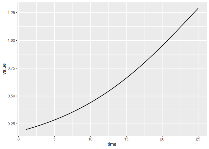
column. Let’s focus on those. We can use this SIR example.
library(macpan2); library(tidyverse)
## ── Attaching core tidyverse packages ─────────────────────── tidyverse 2.0.0 ──
## ✔ dplyr     1.1.4     ✔ readr     2.1.5
## ✔ forcats   1.0.0     ✔ stringr   1.5.1
## ✔ ggplot2   3.5.1     ✔ tibble    3.2.1
## ✔ lubridate 1.9.3     ✔ tidyr     1.3.1
## ✔ purrr     1.0.2
## ── Conflicts ───────────────────────────────────────── tidyverse_conflicts() ──
## ✖ dplyr::all_equal() masks macpan2::all_equal()
## ✖ dplyr::filter()    masks stats::filter()
## ✖ dplyr::lag()       masks stats::lag()
## ℹ Use the conflicted package (<http://conflicted.r-lib.org/>) to force all conflicts to become errors
sir = mp_tmb_library("starter_models", "sir", package = "macpan2")
sim = mp_simulator(sir, time_steps = 25, outputs = "infection")
dat = mp_trajectory(sim)
print(dat)
##       matrix time row col     value
## 1  infection    1   0   0 0.1980000
## 2  infection    2   0   0 0.2169692
## 3  infection    3   0   0 0.2376233
## 4  infection    4   0   0 0.2600847
## 5  infection    5   0   0 0.2844793
## 6  infection    6   0   0 0.3109346
## 7  infection    7   0   0 0.3395786
## 8  infection    8   0   0 0.3705380
## 9  infection    9   0   0 0.4039349
## 10 infection   10   0   0 0.4398849
## 11 infection   11   0   0 0.4784928
## 12 infection   12   0   0 0.5198490
## 13 infection   13   0   0 0.5640248
## 14 infection   14   0   0 0.6110669
## 15 infection   15   0   0 0.6609922
## 16 infection   16   0   0 0.7137807
## 17 infection   17   0   0 0.7693697
## 18 infection   18   0   0 0.8276464
## 19 infection   19   0   0 0.8884416
## 20 infection   20   0   0 0.9515225
## 21 infection   21   0   0 1.0165878
## 22 infection   22   0   0 1.0832626
## 23 infection   23   0   0 1.1510954
## 24 infection   24   0   0 1.2195575
## 25 infection   25   0   0 1.2880447
If we are simulating a single variable, the matrix column will be
constant and so we will use recipes like this.
(dat
  |> ggplot()
  + geom_line(aes(time, value))
)
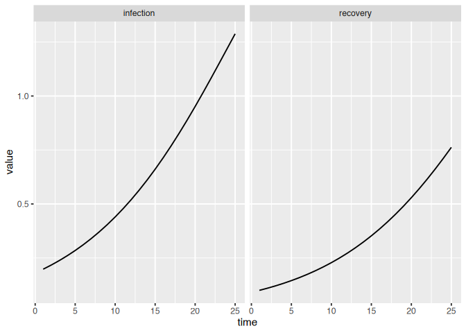
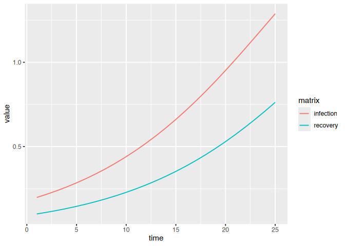
If we have multiple variables we can use the matrix column in our
visualizations to keep track of different variables.
sim = mp_simulator(sir, time_steps = 25, outputs = mp_flow_vars(sir))
dat = mp_trajectory(sim)
(dat
  |> ggplot()
  + geom_line(aes(time, value))
  + facet_wrap(~matrix)
)
(dat
  |> ggplot()
  + geom_line(aes(time, value, colour = matrix))
)
We have so far focused on specifying flows with either constant
per-capita rates or mass-action rates. There are a variety of
mathematical
functions
that you can use to build more complex functional forms for these rates.
 |
| Build a simple model with seasonal cycles in transmission. What are some other forms of complexity in the functional forms of rates? Try to implement them. Keep in mind that you can use tilde-based expressions to define intermediate variables. |
Unbalanced Flows
So far we have used the
mp_per_capita_flow
function that specifies perfectly balanced flows – the total number out
of the from box is equal to the total number into the to box. But
processes like birth/death and importation do not behave this way – for
example, birth adds individuals to the to box without removing
individuals from the from box. Viral shedding into wastewater is
another process that is not a balanced flow. The above linked help page
describes two other kinds of flows that are not balanced.
|
Modify one of your models to include birth and death. Allow for the possibility of more birth than death. If your model uses a constant total population size, N, you will need to add expressions that update N dynamically. |
|
| Add a wastewater compartment to an existing model. |
|
| Add a vaccinated compartment to an existing model. How will you model vaccination supply? |
Relationships Parameters and Simulations
|
Use the mp_tmb_calibrator and mp_trajectory_par functions to plot different trajectories of a single variable in a compartmental model, with each trajectory associated with a change in a model parameter. For example, you could use the SIR model to plot different incidence trajectories for different values of the transmission rate, beta. |
 |
| You will need to loop over a set of beta values somehow. |
Modifying Model Specifications
|
Use mp_tmb_insert to reparameterize an existing SIR model specification. Use the relationship that R0 = beta/gamma to parameterize the model in terms of R0 and gamma. |
|
Create a standard R vector containing as many elements as time steps. Each element gives the value that you want for R0 at each time. Use mp_tmb_insert to add this vector to the default list. Using this same function, insert an expression at the beginning of the during phase that updates beta using the appropriate value that the current time step. Note that the output of x[time_step(1)] is the value of the vector x associated with the current time step. |
|
Update the SIR model so that it is parameterized in terms of the log of the recovery rate, gamma, as opposed to gamma. This can be helpful when fitting models to data, because it ensures that gamma must be positive. |
Understand the Math Behind Simulation Models
|
| Use the mp_expand function to expand the flows-based form of the SIR model into a more explicit form. Using the output of this function, identify the type of dynamical model? |
Calibration
Calibrate to Simulation Data
The first thing you should do when trying a new model fitting technique,
is to see what happens when you fit to data simulated from your model.
Here are data on the number of infectious individuals (or prevalence)
generated by an SIR model.
simulated_sir = read_csv("https://raw.githubusercontent.com/canmod/macpan-workshop/refs/heads/main/data/simulated-sir.csv")
## Rows: 100 Columns: 3
## ── Column specification ───────────────────────────────────────────────────────
## Delimiter: ","
## chr (1): matrix
## dbl (2): time, value
##
## ℹ Use `spec()` to retrieve the full column specification for this data.
## ℹ Specify the column types or set `show_col_types = FALSE` to quiet this message.
|
| Calibrate the SIR model to these data generated from the SIR model. Note that the default values of the SIR model have been changed so that this is not a trivial exercise. |
|
| The answers are here |
|
| Calibrate to a subset of these data that start after time step 25, to simulate the common problem that we do not get data at the beginning of an epidemic – although you would know more … is surveillance getting better? |
early_on_covid_reports = read_csv("https://raw.githubusercontent.com/canmod/macpan-workshop/refs/heads/main/data/early_covid_on_reports.csv")
## Rows: 147 Columns: 4
## ── Column specification ───────────────────────────────────────────────────────
## Delimiter: ","
## chr  (2): province, var
## dbl  (1): value
## date (1): date
##
## ℹ Use `spec()` to retrieve the full column specification for this data.
## ℹ Specify the column types or set `show_col_types = FALSE` to quiet this message.
|
Modify the SIR model and calibrate it to the initial phase of the early_on_covid_reports data. the SIR model to these data generated from the SIR model. You will need to change the names of the variables in the data using the rename function in the tidyverse. Note that you will need to update the default values to be more suitable for Ontario. For example, the population of Ontario is about 14 million. You might want to modify other values. What other modifications could you make to the model to fit better? This is meant to be a challenge. My imperfect answer is here, but try not to look. |
Inference
Visualize Goodness-of-Fit
Here are some ggplot2 recipes for visualizing goodness-of-fit. If you
had a fitted calibrator called model_calibrator that were fitted to
observed_data, you can use this recipe (not run).
fitted_data = mp_trajectory(model_calibrator)
(ggplot()
  + geom_point(aes(time, value), data = observed_data)
  + geom_line(aes(time, value), data = fitted_data)
  + theme_bw()
)
If you would like to visualize uncertainty around this fitted
trajectory, you can use the geom_ribbon function in ggplot2.
fitted_data = mp_trajectory_sd(model_calibrator, conf.int = TRUE)
(ggplot()
  + geom_point(aes(time, value), data = observed_data)
  + geom_line(aes(time, value), data = fitted_data)
  + geom_ribbon(aes(time, ymax = conf.high, ymin = conf.low), data = fitted_data)
  + theme_bw()
)
Confidence Intervals for Estimated Parameters
|
| For one of your calibrated models, use the mp_tmb_coef function to get parameter estimates with confidence intervals. |
Note that you will need to use conf.int = TRUE option that is a little hidden in the documentation, but it is there. Did any of your parameters have an interval that overlaps zero? If so try to fix this by fitting the log transformed version of the offending parameter. If you call the log of your parameter log_{name-of-parameter}, the confidence intervals will be automatically back-transformed to the original scale and will not overlap zero. Did you get any NaNs (not a number)? This is a sign of a bad fit. |
Forecasts and Scenarios
Let’s keep it simple again and get more practice simulating and fitting.
You can use this calibrated model to practice making forecasts and
exploring scenarios.
|
Simulate 50 time steps of incidence (i.e., the infection flow) from the SIR model in the library with defaults. Create a calibrator but change the default values of beta and gamma so that the optimizer will need to do work to find the true values. Then calibrate your model to the simulation data using mp_optimize. After optimizing use mp_forecaster to extend 50 more time steps, so that the entire simulation would be 100 time steps. Use mp_trajectory_sd to produce forecasts with confidence intervals. |
|
| Create a scenario for beta, where transmission increases by a factor of 1.2 at time 60 (10 time steps after the data end). The answers for this exercise are here. |